Skip to content
Health, Government & Non-Profit Reporting

Turning data into clear, useful reports.

I am a finance and reporting professional building my career in health, government and non-profit reporting. I use Excel, Power BI and SQL to create clear reports, check data, and explain the main findings in simple language.

15+
Years finance & reporting experience
4
Tools: Excel · SQL · Power BI · Python
3
Sectors: health · government · non-profit
Tools
Excel SQL Power BI Python
Focus areas
NSW ED targets Elective surgery Access equity
Availability
Open to reporting, data quality & business support roles · Sydney · Hybrid / On-site
About

From finance reporting to data that supports better decisions.
Clear reports, careful work, useful insights.

Portrait of Arina Rud
📍Sydney, Australia
🎾Tennis coach & competitor
🎬Finance & film production background
📊Health, government & non-profit reporting

Hi, I'm Arina Rud — most people call me Arisha. I am a finance and reporting professional based in Sydney.

I worked for more than 15 years in finance and reporting in Moscow, including in film production. My work included financial reports, payment schedules, expense reports, management reports and documentation for senior leaders and investors.

After moving to Australia, I decided to build my skills in data analysis and reporting. I am studying Excel, Power BI, SQL, basic statistics and Python. I am also creating portfolio projects using public NSW health data — skills that apply just as well to government and non-profit reporting.

My goal is to work in a reporting analyst, data reporting, business support or project support role in a health, government or non-profit organisation. I want to help teams make better decisions from accurate and well-organised data.

📊
Finance and reporting experience More than 15 years preparing financial, operational and management reports.
🔍
Careful data checking Focused on accuracy, clean documentation and checking information before reports are shared.
💬
Clear communication Experienced working with managers, investors, employees, vendors and contractors.
Resume

Skills & experience.

Skills snapshot

Excel Advanced
SQL Beginner / Developing
Power BI Intermediate / Developing
Python Beginner
KPI design Stakeholder reporting Clear writing

Experience

Finance & Reporting Manager
Kinocompania / Russkoe Kino · Moscow · 2006–Present
  • Prepared production progress, expense, payment schedule and management reports for senior leaders, executive producers and investors.
  • Established a reporting system adopted across the company, improving consistency and visibility of project and payment reporting.
  • Maintained accurate financial documentation across payroll support, payment processing, banking, budgeting and accounts payable/receivable.
Management reporting Financial documentation Stakeholder communication
↓ Download Resume
Projects

Reporting & data portfolio projects.

Each project shows the question, data source, analysis steps, main findings and next questions.

Project 02 Portfolio case study

NSW ED performance — Metro vs Regional

An Excel reporting project looking at NSW emergency department results in 2025. It compares metro and regional LHDs and summarises the main changes.

Project 03 Portfolio case study

Elective Surgery — Performance Overview

A Power BI dashboard showing long-term elective surgery activity, waiting list pressure, overdue patients and on-time performance.

Project 04 Portfolio case study

Elective Surgery — LHD Comparison

A Power BI dashboard comparing latest-quarter waiting lists, overdue patients, on-time rates and surgery volumes across Local Health Districts.

Project 05 In progress

Hospital in the Home — Adoption & Outcomes

A planned Power BI project showing service activity and differences across Local Health Districts.

Project 06 In progress

First 2000 Days — Equity Snapshot

A planned project looking at early childhood health indicators and differences by area.

Project 07 Planned

Regional Access Capstone — What Drives Differences?

A final project combining results from the earlier projects to look at metro and regional differences.

Contact

Let's connect.

I'm actively looking for reporting analyst, data reporting, data quality, business support and project support roles in health, government, non-profit and other data-driven organisations. If you're a recruiter or hiring manager, I'd love to chat about how my finance reporting background and portfolio projects align with what your team needs.

Based in Sydney · Available for hybrid or on-site roles

Portfolio case study Project 01

Elective Surgery

Specialty pressure summary

Project question: Which elective surgery specialties show the highest waiting list, overdue and backlog pressure?

Power BI Dashboard Specialty comparison Backlog pressure NSW health data
Ophthalmology
Largest waiting list
Neurosurgery
Highest overdue rate
Ear, nose and throat
Lowest on-time rate
Ear, nose and throat
Highest backlog pressure

Interactive dashboard

This public Power BI report can be filtered by year and quarter. If the embedded view does not load, use the Open dashboard button above.

What I found

  • Specialty pressure is different depending on the measure used.
  • Ophthalmology has the largest average waiting list.
  • Neurosurgery has the highest overdue rate.
  • Ear, nose and throat surgery has the lowest on-time rate.
  • Ear, nose and throat surgery also shows the highest backlog pressure.
  • The matrix and scatter plot help separate high-demand specialties from stronger-performing specialties.

How I built the dashboard

  • Grouped elective surgery records by specialty and quarter.
  • Created measures for waiting list average, overdue rate, on-time rate and backlog pressure.
  • Used summary cards to show the highest-pressure specialty for each measure.
  • Built a matrix so each specialty can be compared across multiple indicators.
  • Added a scatter chart to compare waiting list pressure with surgical performance.

What I would check next

  • Review specialty results by LHD to see where pressure is concentrated.
  • Compare specialty demand with theatre capacity and workforce context.
  • Check whether urgency mix changes the backlog picture.
  • Review longer-term trends for the highest-pressure specialties.
  • Check whether the same specialties remain under pressure across multiple quarters.

Data notes

  • Source: public NSW elective surgery performance data used for a portfolio Power BI dashboard.
  • The visible report covers Jan 2021 to Mar 2026.
  • The dashboard compares specialties using NSW-level specialty data.
  • The Power BI embed is public and should only include public, non-sensitive data.
  • This dashboard shows where pressure appears strongest. It does not prove why the pressure exists.
Portfolio case study Project 02

NSW ED performance

Metro vs Regional comparison

Project question: How did NSW ED performance change during 2025, and how did metro and regional results compare?

Excel KPI definitions Trend analysis Metro vs Regional Triage mix
−3.5 pp
NSW discharge within 4 hrs
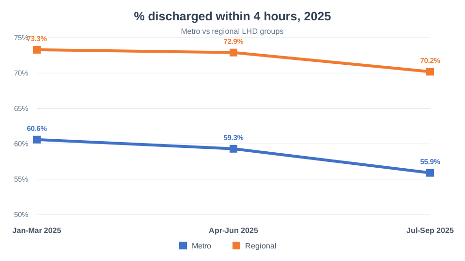
66.7% → 63.2%
−4.7 pp
Metro LHD 4-hr discharge
60.6% → 55.9%
−3.1 pp
Regional LHD 4-hr discharge
73.3% → 70.2%

What I found

  • ED performance got worse across 2025.
  • The main 4-hour discharge result fell from 66.7% to 63.2% across NSW.
  • Metro results were lower than regional results in every quarter.
  • Both metro and regional areas fell by Jul-Sep 2025.
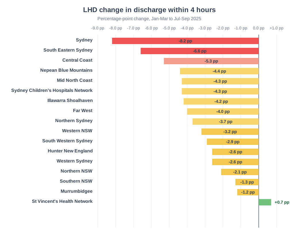
  • Sydney, South Eastern Sydney and Central Coast had the biggest drops.
  • Admit/transfer within 6 hours also fell, from 35.2% to 30.0%.

What the charts show

1. Metro vs regional trend

Open full size
Line chart showing metro and regional LHD discharge within 4 hours across 2025 quarters

Key takeaway: Regional LHDs stayed higher than metro LHDs, but both groups fell by Jul-Sep 2025.

2. Largest LHD drops

Open full size
Bar chart ranking LHD percentage-point change in discharge within 4 hours from Jan-Mar to Jul-Sep 2025

Key takeaway: Sydney, South Eastern Sydney and Central Coast had the largest drops in 4-hour discharge.

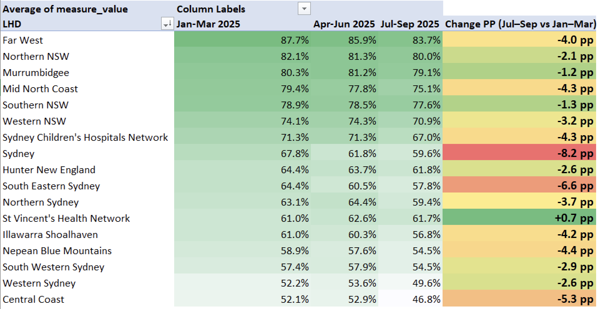
3. LHD detail view

Open full size
Heatmap of LHD discharge within 4 hours by quarter and percentage-point change

Key takeaway: Many regional LHDs started from a stronger position, but almost every LHD or network shown declined by Jul-Sep 2025.

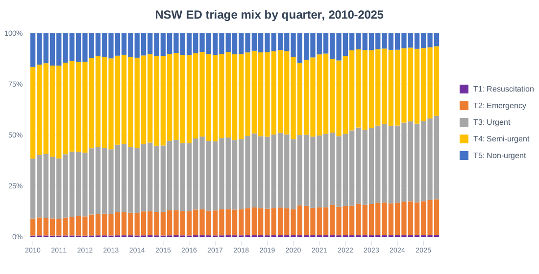
4. Triage mix context

Open full size
Stacked column chart showing NSW ED triage mix by quarter from 2010 to 2025

Key takeaway: Emergency and urgent presentations make up a larger share over time. This may help explain pressure on ED performance, but it does not prove the cause.

How I built the report

  • Filtered ED target-time measures to Jan-Mar, Apr-Jun and Jul-Sep 2025.
  • Built pivot summaries for NSW, LHD and metro vs regional views.
  • Calculated percentage-point change from Jan-Mar to Jul-Sep 2025.
  • Used triage data to review ED visit numbers and category mix.
  • Checked missing values, 0-100% ranges, quarter order and calculations.

What I would check next

  • Compare ED visit numbers by LHD to see whether volume changed.
  • Review triage mix by metro and regional LHDs.
  • Check seasonality, including winter and flu-season demand, to see whether it may explain some of the Jul-Sep decline.
  • Check admitted patient flow, capacity and staffing context.
  • Test whether weighted averages change the metro vs regional comparison.

Data notes

  • Source: public NSW health performance reporting exported into portfolio workbooks.
  • Target-time results are reported as % within target.
  • Measures include 4-hour discharge, SSU within 4 hours, admit/transfer within 6 hours, and 12 hours or less in ED.
  • The metro and regional results use simple LHD averages. They are not weighted by ED visit numbers.
  • 2025 reporting reflects updated NSW Health Hospital Access target measures.
  • This report shows what changed. It does not prove why it changed.
Portfolio case study Project 03

Elective Surgery

Performance overview

Project question: How has NSW elective surgery performance changed from 2010 to Mar 2026?

Power BI Dashboard Trend analysis Waiting list pressure Public health data
3.56M
Total surgeries
Jan 2010-Mar 2026
41%
Waiting list growth
2010 to latest quarter
54%
Overdue patient growth
2010 to latest quarter
90%
Average on-time surgery rate

Interactive dashboard

This public Power BI report can be filtered by reporting level and Local Health District. If the embedded view does not load, use the Open dashboard button above.

What I found

  • Waiting lists grew over the long term, especially after 2018.
  • Overdue patients increased sharply during 2020-2022.
  • On-time surgery performance was stronger before 2020 and has not fully returned to earlier levels.
  • Total surgeries show a clear long-term pattern, with disruptions around 2020-2022.
  • The dashboard helps separate activity volume from waiting list and overdue patient pressure.

How I built the dashboard

  • Loaded public NSW elective surgery performance data into Power BI.
  • Created views for NSW, LHD and hospital reporting levels.
  • Built summary cards for total surgeries, waiting list growth, overdue patient growth and on-time rate.
  • Added trend charts to show long-term changes from 2010 to 2026.
  • Added LHD comparison charts to make the latest-quarter pressure easier to scan.

What I would check next

  • Compare results by urgency category and specialty.
  • Review hospital-level results inside the highest-pressure LHDs.
  • Check whether seasonality or scheduling patterns affect the latest-quarter results.
  • Compare waiting list pressure with surgery volume and on-time rate together.
  • Check cancellation, theatre capacity and staffing context if available.

Data notes

  • Source: public NSW elective surgery performance data used for a portfolio Power BI dashboard.
  • The dashboard covers Jan 2010 to Mar 2026.
  • The Power BI embed is public and should only include public, non-sensitive data.
  • This dashboard shows patterns and pressure points. It does not prove the cause of the changes.
Portfolio case study Project 04

Elective Surgery

LHD comparison

Project question: Which Local Health Districts show the highest elective surgery waiting list and overdue patient pressure in Jan-Mar 2026?

Power BI Dashboard LHD comparison Latest quarter NSW health data
4.2%
Overdue waitlist
Jan-Mar 2026
92.4K
Waiting list
Jan-Mar 2026
3.96K
Overdue patients
Jan-Mar 2026
83.4%
On-time rate
Jan-Mar 2026

Interactive dashboard

This public Power BI report compares Local Health Districts for the latest quarter. If the embedded view does not load, use the Open dashboard button above.

What I found

  • Elective surgery pressure is not evenly spread across Local Health Districts.
  • South Western Sydney has the highest overdue patient volume.
  • Hunter New England has the largest waiting list.
  • On-time rates vary widely across LHDs, from 68.1% to 99.6%.
  • Sydney shows the strongest on-time performance in the latest quarter.
  • Backlog reduction should focus first on South Western Sydney and Hunter New England.

How I built the dashboard

  • Filtered the elective surgery data to the latest quarter.
  • Grouped results by Local Health District.
  • Created summary cards for overdue waitlist, waiting list, overdue patients and on-time rate.
  • Built ranking charts for waiting list, overdue patients, on-time rate and total surgeries.
  • Used a heatmap-style table so high-pressure LHDs are easier to scan.

What I would check next

  • Review hospital-level results inside the highest-pressure LHDs.
  • Compare LHD pressure by specialty and urgency category.
  • Check whether waiting list pressure is linked to surgery volume or capacity.
  • Review trends across multiple quarters, not just the latest quarter.
  • Add context about theatre capacity, cancellations and staffing if available.

Data notes

  • Source: public NSW elective surgery performance data used for a portfolio Power BI dashboard.
  • The dashboard focuses on the latest quarter: Jan-Mar 2026.
  • LHD results compare total surgeries, on-time rate, waiting list and overdue patients.
  • The Power BI embed is public and should only include public, non-sensitive data.
  • This dashboard shows where pressure is highest. It does not prove why the pressure exists.